

Cartoon art styles are easier to choose when you stop treating them as a list of names. Look at five visible decisions instead: shape, line, color, shading, and material. Those choices determine whether an image feels playful, dramatic, handmade, cinematic, nostalgic, or compact enough to read as a small avatar.
This guide groups common styles by what they actually do to an image. It also explains which looks suit portraits, original characters, story scenes, and short videos. If you want to compare the available looks before generating, open the cartoon and anime style library. For a photo-based project, start with the photo-to-cartoon tool. For an original scene, use text to cartoon.
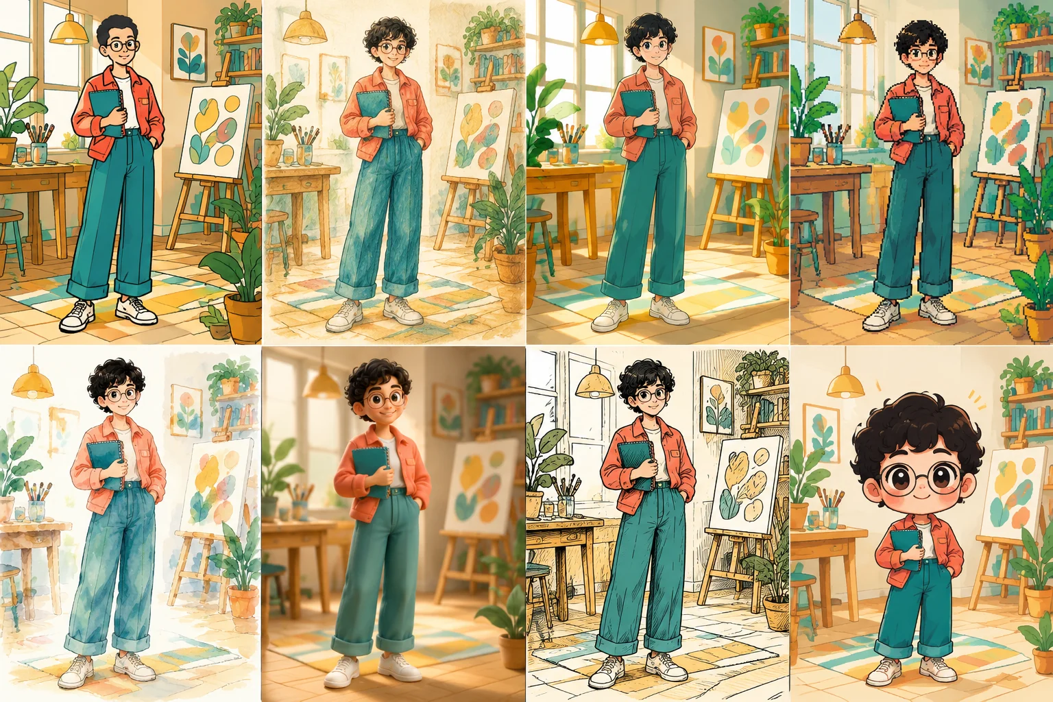
What defines a cartoon art style?
A cartoon art style is a consistent set of visual decisions used to simplify, exaggerate, or reinterpret a subject. A style can change anatomy, facial proportions, edge quality, color relationships, depth, texture, and the amount of detail in a scene.
Style labels often mix different ideas. Anime describes a broad animation and illustration tradition. Watercolor describes a medium. Pixel art uses deliberate resolution constraints. Chibi describes proportions. Cel shading describes how light and shadow are rendered. A 3D toon look describes volume and material, but not necessarily an editable 3D model.
Current guides commonly organize 25 or 40 examples by era, medium, or production tradition. That helps with reference, but less with choosing one look for a real project.
Adobe's overview of cartoon art styles notes that recognizable cartoon styles exaggerate selected features. The important word is selected. A successful style does not simplify everything equally. It preserves the features that carry identity or meaning and pushes the rest toward a clearer visual idea.
A five-part way to compare cartoon art styles
Use the same five questions whenever you inspect a style. They work for a portrait, a pet, a fictional character, or a full environment.
| Visual decision | What to inspect | Why it changes the result |
|---|---|---|
| Shape | Head-to-body ratio, silhouette, facial features, hands | Shape controls readability, age, energy, and how strongly the subject is exaggerated. |
| Line | Thick or thin outlines, clean or textured edges, black or colored linework | Line affects clarity at small sizes and whether the image feels graphic, delicate, or hand drawn. |
| Color | Saturation, palette size, local color, contrast | Color sets the emotional temperature and determines whether a busy scene stays readable. |
| Shading | Flat blocks, hard cel shadows, soft gradients, painted values | Shading controls depth and shifts a result from flat illustration toward cinematic volume. |
| Material | Paper grain, paint bloom, pixels, clay, fabric, polished surfaces | Material tells the viewer how the imagined image was made and changes what kinds of detail feel natural. |
These categories are not scores. More detail is not automatically better. A bold flat cartoon can communicate an expression faster than a highly rendered image. A watercolor scene can suggest atmosphere with edges that would look imprecise in a logo.
Eight useful families of cartoon art styles
The following groups are broad enough to guide a project without pretending that every image fits one rigid label. The examples use existing artwork from AI Cartoon Generator's style workflows. They are not a controlled benchmark: the subjects and prompts differ, so compare the visual language rather than treating them as a quality ranking.
1. Flat 2D cartoon
Flat 2D cartoon art uses simplified shapes, clear silhouettes, limited shading, and colors that separate cleanly. Outlines are often bold enough to survive a small display size. Expressions can be pushed without needing realistic anatomy.
This is a dependable choice for profile images, stickers, simple mascots, and scenes that need immediate readability. If the image must work at 64 pixels wide, large shapes and firm contrast matter more than subtle surface detail.
The main risk is generic design. If every face uses the same eyes, mouth, and bean-shaped body, different characters begin to merge. Preserve two or three identity anchors such as a hairstyle, glasses, a jacket silhouette, or a distinctive accessory.
2. Anime-inspired illustration
Anime is not one fixed drawing formula. It covers many proportions, line treatments, lighting choices, and production traditions. Common signals include controlled linework, intentional facial construction, grouped hair shapes, and cel-like shadows.
Choose this family for expressive character portraits, action scenes, fantasy settings, and projects where costume and pose need to communicate personality. The photo-to-anime workflow is useful when the source photo already supplies the face, pose, clothing, and composition.
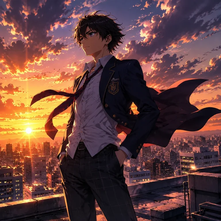
Watch facial identity carefully when converting a real portrait. Larger eyes, a smaller nose, and simplified cheek structure can produce a convincing anime image while reducing resemblance. Glasses, fringe shape, hair parting, and face outline often need more attention than eye color.
3. Inked comic art
Comic art usually relies on decisive contour lines, controlled black shapes, deliberate panel-ready composition, and a stronger separation between subject and background. Some variants use flat color and halftone texture; others use painted rendering or dense cross-hatching.
It works well for action poses, cover-like character art, and single-frame narrative moments. A strong comic image should remain legible before dialogue or captions are added.
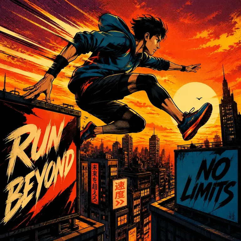
A single comic-style image is not the same as a finished comic page. Multi-panel continuity, gutters, speech balloons, reading order, and repeated character identity are separate production problems. Do not choose a comic look because you expect one image generator setting to solve the whole page.
4. Chibi and cute proportion styles
Chibi proportions enlarge the head, shorten the limbs, simplify the torso, and concentrate attention on the face and pose. Small hands and feet reduce anatomical detail, while accessories and hair become larger identity markers.
This family suits reaction images, stickers, compact avatars, and cast lineups where each character needs a readable silhouette.
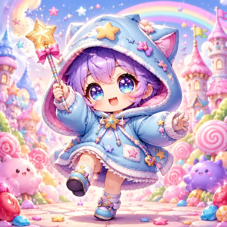
The hard part is not making the character small. It is deciding what survives the reduction. Keep signature colors and one or two accessories. Avoid a detailed background that competes with a figure designed for compact reading.
5. Watercolor and storybook painting
Watercolor styles use translucent color, soft edge variation, visible paper or pigment texture, and selective detail. They are especially effective when atmosphere matters more than exact geometry. A wash can connect sky, foliage, and architecture without rendering every surface.
Choose watercolor for story scenes, travel memories, pet portraits, and images meant to feel handmade. It works best with breathing room and a clear focal point.
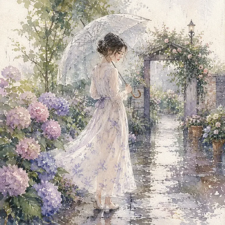
Small text, rigid product geometry, and precise repeating patterns are weak fits. A watercolor treatment may soften the exact edge you need to preserve. When converting a photo, check fingers, glasses, architectural lines, and background signs before accepting the result.
6. Pixel art
Pixel art is not a smooth illustration with a mosaic filter. Its shapes, highlights, and curves are designed around a visible pixel grid and a deliberately limited level of detail. Palette control and cluster placement do more work than soft gradients.
Use it for game-inspired avatars, icons, retro scenes, and images that need a strong digital identity. Decide the display size early. Smoothing can blur an enlarged grid, while shrinking a detailed image can collapse important features.

Modern pixel art does not have to reproduce one historical console. The useful constraint is consistency: curves, texture, and highlights should look as if they belong to the same grid.
7. Cel-shaded illustration
Cel shading separates light and shadow into firm regions instead of long gradients. It can make a 3D form appear flatter and more graphic, and works with anime, action-cartoon, or game-inspired character design.
Choose cel shading for crisp volume, readable action, costumes, vehicles, and scenes where the direction of light should remain obvious.
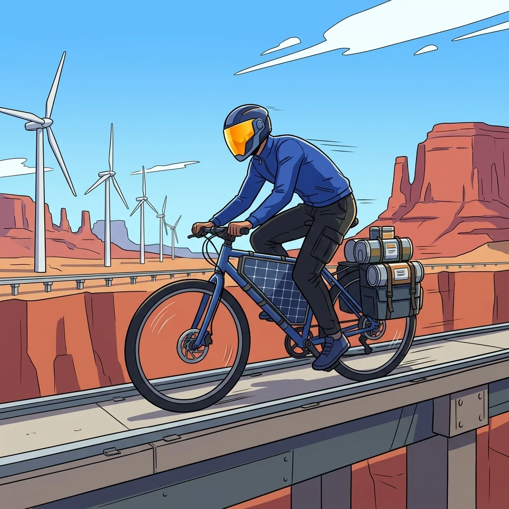
Hard shadow edges expose mistakes quickly. Check whether shadows describe the face and body consistently, whether small features have turned into dark noise, and whether the background uses the same lighting logic as the character.
8. Rounded 3D toon
A rounded 3D toon look uses modeled volume, soft material transitions, controlled highlights, and cinematic depth. Faces often have broad planes and clear expressions, while clothing, hair, and props use simplified but tactile surfaces.
This family works for character portraits, product mascots, and short video concepts that benefit from dimensional lighting.
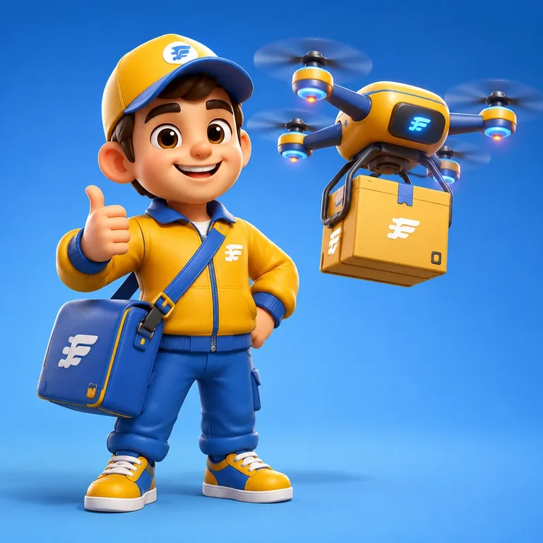
A 3D-looking image is still an image. It does not include a mesh, rig, editable camera, or reusable lighting setup. Use it as concept art if your next step requires true 3D production.
Which cartoon style fits your project?
Start with the final use, then choose the visual language. This keeps an impressive sample from pulling you toward a style that fights the actual format.
| Project | Strong starting choices | What to protect |
|---|---|---|
| Social avatar | Flat 2D, anime-inspired, chibi | Face shape, hairstyle, glasses, readable contrast at small size |
| Pet or family portrait | Watercolor, rounded 3D toon, soft 2D | Markings, subject count, pose, relationship between figures |
| Original character | Anime-inspired, comic, cel-shaded, 3D toon | Silhouette, costume anchors, color palette, proportions |
| Children's story scene | Watercolor, storybook, soft 3D toon | Emotional clarity, gentle focal point, consistent cast details |
| Sticker or reaction set | Chibi, flat 2D, pixel art | Expression, outer silhouette, transparent-edge readability |
| Action image | Comic, cel-shaded, anime-inspired | Pose, camera angle, limb clarity, directional lighting |
| Short cartoon video | Flat 2D, cel-shaded, 3D toon | Stable character anchors, simple action, background consistency |
For a real photo, run the same source through two styles before committing. Keep the crop, aspect ratio, and instructions unchanged. Then compare identity, background reconstruction, edge clarity, and how much correction each result needs. The step-by-step photo-to-cartoon guide explains how to review a conversion without overloading the prompt.
For an original subject, describe the subject, action, setting, and composition, then apply one primary style. The AI cartoon image guide covers that workflow in more detail.
Common mistakes when choosing or prompting a style
Stacking unrelated style words
"Anime watercolor 3D pixel comic" does not create a richer direction. It asks the model to follow conflicting edge, material, and shading systems. Choose one primary family, then add a compatible modifier such as "limited pastel palette" or "hard cel shadows."
Choosing from a thumbnail alone
A style that looks clear in a large sample may fail as a small profile image. Test the result at the size where it will be used. Check whether the face, pose, and important accessory remain readable.
Comparing different subjects
If one sample is a close portrait and another is a wide fantasy scene, you cannot tell whether the difference comes from the style or the composition. Use the same source and settings when you need a fair style comparison.
Treating a brand name as a complete visual brief
A brand or franchise reference hides the decisions you actually care about. Describe visible properties instead: rounded proportions, clean contour lines, warm cinematic light, painted background, or bold graphic shadows. This produces a more controllable brief and makes it easier to develop an original direction.
Ignoring the failure surface
Every style simplifies something. Before choosing a result, inspect faces, hands, subject count, text, repeated patterns, eyewear, pet markings, and background geometry. The best style is the one that keeps the details your project cannot afford to lose.
A simple style test you can repeat
Use this process when two or three looks still seem plausible:
- Pick one source photo or one written scene.
- Lock the aspect ratio, subject, action, camera distance, and background.
- Generate one baseline with no extra style modifiers.
- Apply one style at a time without changing the scene.
- Review shape, line, color, shading, material, and identity.
- View each result at its final display size.
- Keep the strongest direction and make one correction per revision.
This test still includes normal generation variation, but avoids changing the subject, composition, and style together. Run it with a photo in the online cartoon maker or an original scene in the text-to-cartoon generator.
FAQ
What are the main types of cartoon art styles?
Useful families include flat 2D cartoon, anime-inspired illustration, inked comic art, chibi, watercolor or storybook painting, pixel art, cel-shaded illustration, and rounded 3D toon. These categories overlap because some describe a tradition, some describe proportions, and others describe a medium or rendering method.
Which cartoon art style is best for beginners?
A simple flat 2D style is a practical starting point because clear shapes, limited colors, and readable expressions are easier to inspect than complex rendering. Chibi can also reduce anatomical detail, although good proportions and silhouettes still require deliberate choices.
What is the best cartoon style for a profile picture?
Choose a style with a clear face, strong silhouette, and enough contrast to survive a small crop. Flat 2D, anime-inspired portraits, and chibi often work well. Test the image at the actual avatar size before deciding.
Is anime a cartoon art style?
Anime is a broad Japanese animation tradition with many visual approaches, not one fixed face template. In an image-style menu, "anime" usually acts as a practical umbrella for clean linework, stylized proportions, grouped hair shapes, and cel-like shading.
Is cel shading the same as 2D animation?
No. Cel shading is a rendering treatment that uses distinct light and shadow regions. It can be applied to 2D illustration or used to make 3D graphics look flatter and more hand drawn. It does not identify the underlying production method by itself.
Choose the visual decisions before the label
A useful style label gives you a starting direction. The finished image still depends on the subject, composition, palette, and details you protect. Compare shape, line, color, shading, and material, then test the result in its final context.
Browse the full style library when you want to compare available presets. Use photo to cartoon for an existing image, or start with text to cartoon when the character and scene are still an idea.